Tuesday 1 February 2011

Final Piece


Evaluation
For the final piece of Unit 1, the brief was to create a small-press book on a design and topic of our choosing.  This was something I was really excited about doing, and I was happy with the freedom we’d been given to complete this task.  At the time my main inspirations were the Moomins, a book and cartoon series originally created by Finnish author Tove Jansson.  Even before the final piece task had been set, I wanted to create a character that was inspired by the Moomins.  This was a great opportunity to develop such a character and give them a story.  

I tried to keep the art style fairly similar to that of the one Tove Jansson uses to illustrate her Moomin books, particularly the eyes of the characters and the use of cross-hatching for shading and detail.  The comic’s story itself was inspired by my own thoughts of what it would be like to be transported into Moominland – this I then translated into my own original world and story. 

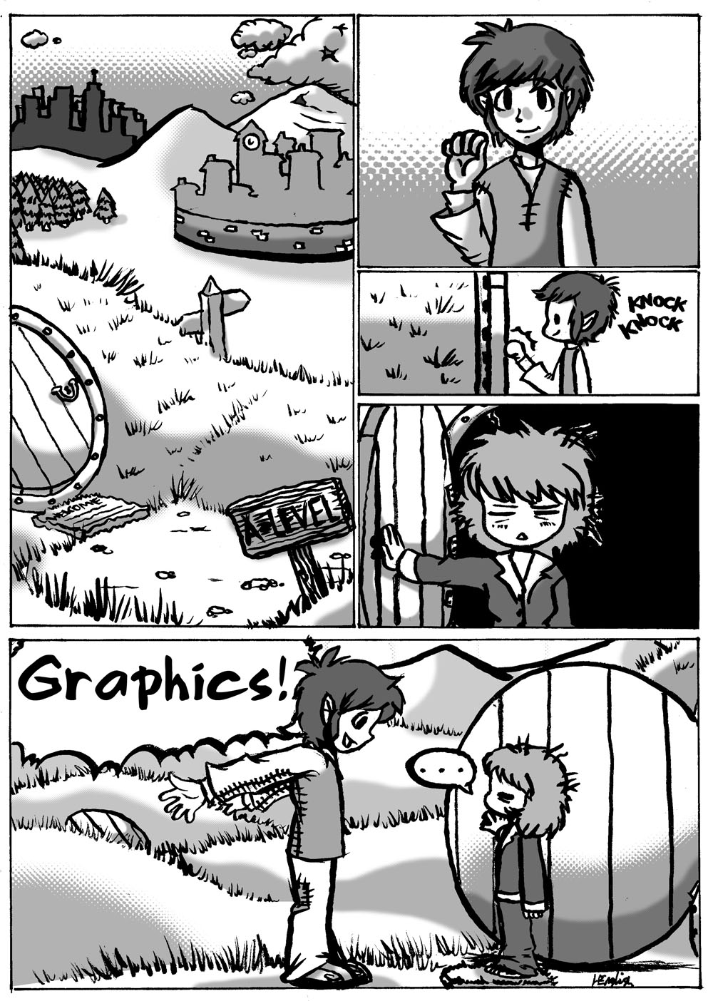
The first page, where Tisk’s life seems to be going badly, lacks shading and detail to represent how bland and uninspired her life feels.  Then, as her life gets progressively better, (plus the deeper we get into Tisk’s life and more 3-dimensional she - hopefully - may appear as a character) the more shading and detail I added.  Also, the panels are very linear and structured until the fourth page; when Tisk groggily wakes up and begins to realise that she is in another world, the panel’s structure slowly deteriorates until it has completely fallen away.  From that point on the panels are not only unkempt and without structure, but are sometimes round, their boundaries are obstructed, and sometimes are plain not there at all, to represent the whimsical and enchanted world and things happening around her, in contrast to the linear, monotonous structure of her previous, regular life on Earth.  (Deep, huh? :D)

Monday 10 January 2011

Development of Final Piece

Final Piece Storyboard


Evaluation

For the actual content of the final piece, I decided to do a structured narrative in a comic-book style.  This is a style I find easy and I like, so the creation was very enjoyable to do.  Before I started the final piece I did a fairly detailed plan of what would happen, any speech involved, and how the panels would be structured.  I did two drafts to this plan in all, and then I started on the actual final piece, which I did in pencil and then inked with a variety of 0.3, 0.5 and 0.8mm Multiliner inking pens.  The very last panel I used purple ink for to fill in the large space.  Unfortunately I had run out of black ink, which is what I wanted to use, and the first purple ink I had used ran out halfway through me using it, so I had to go onto a different purple ink.  If I were to do it again then I would have made sure to have plenty of black ink at hand!


Designing the main character

My the story for my final piece focused on one particular character, so I needed this character's design to be carefully planned.

I wanted the style I was going to use to be based or somehow linked to that of author and illustrator Tove Jansson's.  I decided to focus a few of her characters from her Moomins series.

Here are Snufkin, Too-ticky, The Joxter, Toft, and Little My, drawn by their creator Tove Jansson:


I sketched these characters in my own style:


Then I decided to concentrate on three of these characters - Snufkin, Too-ticky and The Joxter.


I then began to come up with designs for my own character, considering some Tove Jansson's characters' features and designs and attempting to make a design that would fit into Jansson's Moominvalley universe.


Here is my final design:


Evaluation
After some development and refining, I ended up with Tisk, a short, dark-haired, androgynous-looking girl.  Her androgynous look was inspired by the gender-related ambiguity of some of Tove Jansson’s characters; particularly her character Too-Ticky, who looks like she could easily be a boy, as well as her character Toft, who looks like he could be female.  The ways in which I had experimented with Tisk’s design includes her body-shape, height, and the way she dressed, but I feel her general look has managed to keep well to the original sketch I did of her in my notebook. Although by a Finnish author, the Moomin books were originally written in Swedish; my characters name, "Tisk" is the Swedish for "voyages", to link to the Moomins further.

Case Study

The case study I've chosen is "Woweezonk: Pobody's Nurfect" by Patrick Kyle, Ginette Lapalme and Chris Kuzma (Koyama Press).

Personal Response 


What drew my attention first to "Pobody's Nurfect" was the colour contrasts and the way they clashed with each other.  The book is detailed and yet simplistic at the same time, and sort of reminds me of the animated bits of Monty Python.  Particularly because of the crazy ideas and imagination involved, and partly because there's something about it that's a bit disgusting.

I like "Pobody's Nurfect" because it has a lot of imagination and emotion, there's a lot to look at and a lot of it contains a good sense of humour, but I'm not so fond of the fact that it hurts my eyes and brain and is really kind of gross.  Admittedy, I didn't like at first because of these reasons but my opinion changed over time as I got used to the styles and allowed myself to be more objective and openminded about them.  I love the way that just by looking at certain pages, it makes me want to draw big pictures with lots of things going on, of a similar ilk to it. 


Form 


The colour palette is bright, flourescent and clashing - using in particular reds, pinks, greens and yellows.  As it is a collaboration between three artists, there are lots of different styles that constrast and go together really well.  Not only are the styles different but the artists each use different mediums and materials.  Maybe this is for contrast and variety, or maybe tofurther distinguish each of the artists' work.
The words I would use to goofily describe it are VIGOROUS, ANGRY, PASSIONATE, WEIRD and ADVENTUROUS.

Throughout there is a lot of "evidence of the hand that made it".  There are quite a few "imperfections" like colour leaking outside of the lines, and other little subtlties and inconsistencies that a computer could not replicate. These only further its awesomeness, making it feel more handmade and creative, and less polished in an artistic and fun way.  As if the mistakes were done on purpose.

Textures have been rendered by comic shorthand; it is unrealistic and only a small amount of lines have been used to convey folds in clothes, skin and texture.  However there are a few pages that include more detailed art involving more lines.  Space is used to make the reader focus on the main picture or a particular aspect of it.  The overall perspective is abstract.

The composition seems pretty much random – there is little structure, sense, or apparent control to it – it seems to have been thrown together, but with positive effect.  


Context and Content

“Woweezonk: Pobody’s Nurfect” is a medley of pictures that convey imagination, ideas and emotions.  There seems to be no particular subject matter or narrative but there does seem to be a running theme with bright colours, emotion, humanoid characters used in the pictures, and general crazy weirdness.  It has a form that breaks many conventions.

The title “Woweezonk: Pobody’s Nurfect” is a combination of what appears to be gibberish and a comically imperfect spin on a phrase, probably to reflect the meaning of the phrase itself. 
The book may have been produced for the sake of imagination and creation; a creative outlet for the artists; and perhaps for profit too.


Process


The process is of good quality, using professional means and materials (such as the paper) used.  It primarily uses modern processes, particularly the use of computers and a camera.  There are clues such as some evident editing of some of the picture in photoshop, and it is clearly printed from a computer.  The forward and the book information is computer-processed text – it’s been typed.  However many of the actual pictures have been originally created by hand; the title on the first page is also handwritten.  It seems as though it was thrown together on a computer and then printed.  Skills needed to produce such a piece include computer knowledge, skills in photography and printing, and artistic talent/skills including drawing and painting.  Also general artistic integrity.
Production Plan

Brainstorm

A brainstorm of ideas and notes for my final piece.


Working On the Brainstorm


All About Panel-to-panel Transitions


Here is a comic by Scott McCloud explaining the different types of transitions, with his own examples as well as pasted-in examples from other comics.


I drew some of my own examples:


My Influences