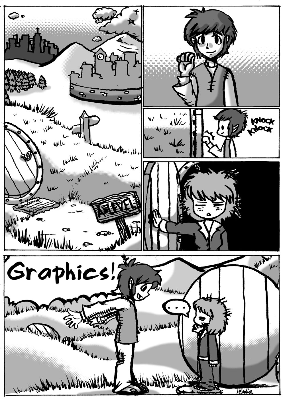
Final Piece Storyboard
Evaluation
For the actual content of the final piece, I decided to do a structured narrative in a comic-book style. This is a style I find easy and I like, so the creation was very enjoyable to do. Before I started the final piece I did a fairly detailed plan of what would happen, any speech involved, and how the panels would be structured. I did two drafts to this plan in all, and then I started on the actual final piece, which I did in pencil and then inked with a variety of 0.3, 0.5 and 0.8mm Multiliner inking pens. The very last panel I used purple ink for to fill in the large space. Unfortunately I had run out of black ink, which is what I wanted to use, and the first purple ink I had used ran out halfway through me using it, so I had to go onto a different purple ink. If I were to do it again then I would have made sure to have plenty of black ink at hand!
Designing the main character
My the story for my final piece focused on one particular character, so I needed this character's design to be carefully planned.
I wanted the style I was going to use to be based or somehow linked to that of author and illustrator Tove Jansson's. I decided to focus a few of her characters from her Moomins series.
Here are Snufkin, Too-ticky, The Joxter, Toft, and Little My, drawn by their creator Tove Jansson:
I sketched these characters in my own style:
Then I decided to concentrate on three of these characters - Snufkin, Too-ticky and The Joxter.
I then began to come up with designs for my own character, considering some Tove Jansson's characters' features and designs and attempting to make a design that would fit into Jansson's Moominvalley universe.
Here is my final design:
Evaluation
After some development and refining, I ended up with Tisk, a short, dark-haired, androgynous-looking girl. Her androgynous look was inspired by the gender-related ambiguity of some of Tove Jansson’s characters; particularly her character Too-Ticky, who looks like she could easily be a boy, as well as her character Toft, who looks like he could be female. The ways in which I had experimented with Tisk’s design includes her body-shape, height, and the way she dressed, but I feel her general look has managed to keep well to the original sketch I did of her in my notebook. Although by a Finnish author, the Moomin books were originally written in Swedish; my characters name, "Tisk" is the Swedish for "voyages", to link to the Moomins further.


